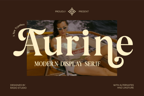
Aurine: A Sophisticated Serif Font for Digital Branding
There it was—my client’s new coaching website hero section, live in Figma, with the headline “Clarity Begins Here” set in a safe-but-sleepy sans serif. I’d been testing fonts all morning, but nothing felt *right*. Not until I dropped in Aurine. Instantly, the space lifted. The contrast between its refined serifs and confident letterforms gave the headline weight, warmth, and quiet authority—like a trusted voice stepping forward without shouting.
What Aurine Brings to the Screen
Aurine is a modern serif font that walks a graceful line: elegant enough for luxury branding, yet bold and grounded enough to hold presence on a fast-scrolling landing page. Its high-contrast strokes, subtle bracketing, and open apertures make it highly legible at larger sizes—even over textured image banners or gradient overlays. As a display font, it’s not trying to be neutral. It’s intentional. It says, “This matters,” without sacrificing readability.
I tested Aurine across multiple real-world web contexts: a boutique online store’s collection headers, a course sales page’s value proposition banner, a portfolio site’s project titles, and even a small business blog’s featured post cards. In every case, it added visual hierarchy and emotional resonance—especially where tone and trust were key. For digital creators building brand identity through typography, Aurine functions less like decoration and more like a quiet ambassador for your values.
How It Performs in Responsive Layouts
On desktop, Aurine shines at 36–60px for hero headlines and 24–32px for section headings. Its generous x-height and well-proportioned spacing prevent crowding, even when tracking is tightened slightly for impact. On mobile? I found it most effective starting at 28px for H1s and 20px for H2s—still crisp, still distinctive. The key is avoiding ultra-thin weights below 24px on smaller screens; stick to the Regular or Medium weights for optimal clarity in responsive layouts.
I also tested it against light and dark backgrounds, including semi-transparent overlays. Aurine’s strong stroke contrast held up beautifully on both—no ghosting or visual fatigue. For accessibility, it pairs naturally with WCAG-compliant color contrast ratios (I used #2D2D2D on white and #F8F8F8 on charcoal), especially when paired with sufficient line height (1.3–1.4) and letter spacing (+0.5px for uppercase usage).
Where Aurine Excels—and Where to Pause
Aurine is ideal for:
- Hero section headlines—it commands attention while feeling human and approachable
- Landing page value statements—“Transform Your Practice” or “Design With Intention” land with sincerity
- Branded call-to-action buttons—used sparingly (e.g., “Start Your Journey”) in Medium weight, it adds premium polish
- Portfolio project titles and category labels—its editorial character elevates creative work without overshadowing visuals
- Digital brand kits—as the primary display typeface alongside a clean sans serif for body copy
It’s not suited for:
- Body text or paragraph content—it’s a display font, not a text face
- Navigation menus or footer links—its personality can distract from utility
- Form labels, input placeholders, or dense dashboard interfaces where functional clarity trumps flair
- Micro-interactions or tiny UI elements (e.g., tab labels under 14px)
Smart Pairing for Web Design
Aurine sings when paired with a highly legible, neutral sans serif—think Inter, Manrope, or a well-hinted version of Helvetica Neue. I used it with Inter (Regular for body, SemiBold for subheads) across three client sites, and the contrast created immediate visual rhythm: Aurine for voice and vision, Inter for clarity and flow. For more editorial or lifestyle brands, a gentle geometric sans like Poppins or a warm humanist option like Lato also harmonize beautifully.
If you’re layering in a script or handwritten font for accents (e.g., signature lines or decorative dividers), keep those uses minimal and opt for low-contrast, airy options—Aurine’s sophistication doesn’t need competition, just thoughtful support.
Practical Considerations Before You Implement
Before dropping Aurine into production, check what’s included: look for at least Regular and Medium weights (Bold is a bonus for emphasis), true italics—not slanted—plus OpenType features like ligatures or stylistic alternates if your design system leans into detail. For web use, confirm WOFF2 support and whether the license covers self-hosted webfonts (many commercial fonts do, but always verify). If you’re using it in client work or SaaS dashboards, ensure the license permits embedding and redistribution.
Multilingual support matters too—if your audience spans European languages, check for extended Latin characters. And while Aurine isn’t built for body copy, having a companion text font with matching metrics (x-height, cap height) makes pairing feel intentional, not accidental.
In the end, Aurine isn’t just another serif font. It’s a tool for tone-setting—subtle, confident, and consistently human. Whether you're refining a founder’s first website or refreshing a decade-old brand kit, it offers that rare balance: distinction without distraction, elegance without distance. It doesn’t shout. It invites. And in today’s crowded digital landscape, that kind of quiet confidence is worth every pixel.